
How Ecommerce Brands Can Use Product Education to Help Shoppers Make More Confident Buying Decisions
On this page
Product education gives online shoppers the information they need to choose an item with certainty. It covers size guides, comparison charts, how-to videos, ingredient explanations, and answers to common questions placed right where people make decisions.
Ecommerce shoppers can’t touch fabric, test a blender, or ask a store employee which model fits their kitchen. Every question left unanswered adds hesitation, and hesitation sends people to another tab or an empty checkout.
Brands that explain their products clearly see fewer returns, fewer support tickets, and more completed orders.
This article covers how to apply product education across your store, from product pages to post-purchase content. We’ll go over some practical methods for identifying what your shoppers want to know, choosing the right format for each answer, and measuring whether your content helps people buy with confidence.
Each section includes examples from successful brands that handle this well.
Side-by-Side Comparisons Help Shoppers Understand Meaningful Differences
Two products can look identical in a product grid. Both show similar features, prices, and photos. Shoppers who can’t tell them apart often postpone the purchase, and a side-by-side comparison gives them a reason to decide now.
Research shows that 67% of participants on spec-driven sites use comparison features when they’re available, so shoppers clearly want this tool.
The most useful comparisons focus on practical factors, like what each product does, who it suits, which devices or accessories it works with, and how it behaves in daily use. A battery rated for a week of use tells a commuter what to expect. When each option gets an honest description, shoppers can match products to their own priorities.
To implement this:
- Discover the questions your support team hears most, since those show which differences confuse shoppers.
- Choose four to six rows that reflect real decisions, such as size, compatibility, battery life, and warranty terms.
- Write each cell in plain language and add units where numbers apply.
- Show products in columns, and keep the labels fixed while mobile users swipe sideways.
- Highlight the best fit for specific uses with short tags like “Best for travel,” and avoid ranking products.
- Place the table on category and product pages.
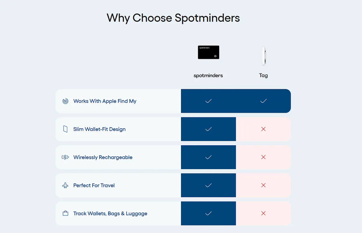
An example of a brand doing this is Spotminders, selling slim trackers that help people keep track of essentials like wallets and bags.
Their homepage includes a comparison table that sets Spotminders against the general competition. The table covers smartphone integration, design, fit, compatibility, and technical specs. This shows how Spotminders compares on each factor before shoppers open a single product page.
This early clarity lets visitors judge practical points, such as whether the tracker fits their wallet and works with their phone, and move forward with confidence. Other brands can apply this same format.
Standardized Evaluation Criteria Make Products with Lots of Variables Easier to Compare
Products with many variables can leave shoppers unsure about which differences deserve attention. Standardized evaluation criteria give them a consistent way to assess each option.
Brands should identify the factors that most influence the purchase, then apply those same criteria across every product being compared. A mattress guide, for example, might assess cooling, motion transfer, edge support, responsiveness, and value for every model.
This approach turns a complex decision into manageable, shopper-friendly comparison points. Clearly defined categories help shoppers understand trade-offs and decide which strengths matter most to them.
An overall score can provide a quick summary, but category-level assessments give shoppers the context they need to make a decision that fits their priorities.
To implement this:
- Interview customers and review support questions to find the five or six factors that drive decisions in your category.
- Define each factor in one sentence and state how you measure it.
- Apply the same scale, such as one to five, to every product.
- Publish your testing method on the page so shoppers understand each score.
- Display category scores in a table, and let shoppers sort or filter by the factor they care about most.
- Review the criteria every year and update them as products change.
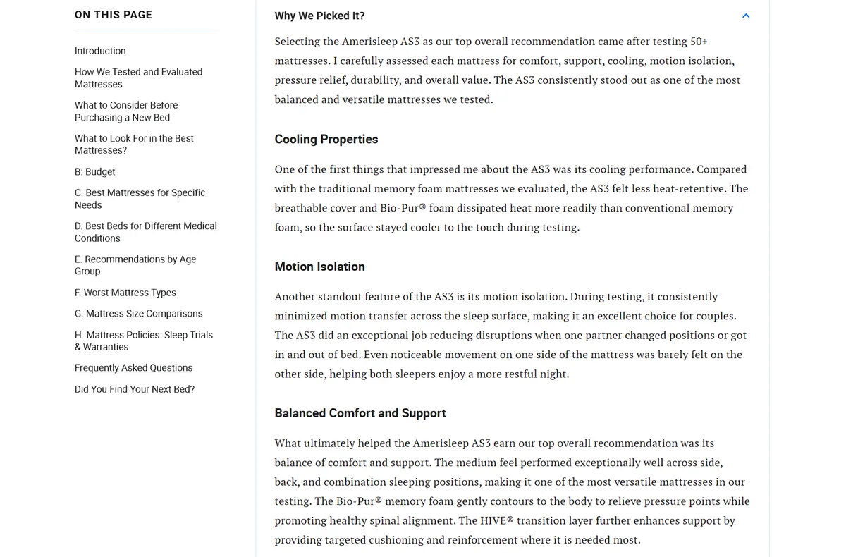
Sleep Junkie is a wellness platform that reviews mattresses and bedroom products.
Their guide, “The Best Mattresses of 2026,” compares every mattress using the same factors: value, edge support, motion transfer, responsiveness, and cooling.
Shoppers who sleep hot can check cooling first. Couples can look at motion transfer, and people who sit on the bed edge can look at edge support. Each reader can build a shortlist from the factors that matter to them.
This shared structure makes comparing many mattresses a quick task for most online shoppers.
Use-Case Education Helps Shoppers Identify the Right Type of Product
Shoppers often know what they want to do before they know what product type does it. A customer planning a weekend at a campground and a customer planning a week on a trail both search for a sleeping bag, and they need different products. Use-case education connects the need to the category.
Brands can organize this content around common situations, intended uses, experience levels, environments, or buyer priorities, and explain why each product type suits specific circumstances. A beginner may value simplicity and a lower price. An experienced buyer may value low weight and compact size.
Explaining these links helps shoppers rule out unsuitable categories early and start comparing products with a defined need in mind.
To implement this:
- List the situations your customers describe most often, using search queries, support chats, and reviews.
- Group your products by those situations, such as home, travel, or professional use.
- Write a short guide for each group that names the right product type, states the main reason, and links to matching items.
- Add a quick quiz or filter that asks about use, environment, and experience.
- Keep language free of jargon, and define any technical term the first time it appears.
- Place the guide on category pages and product pages.
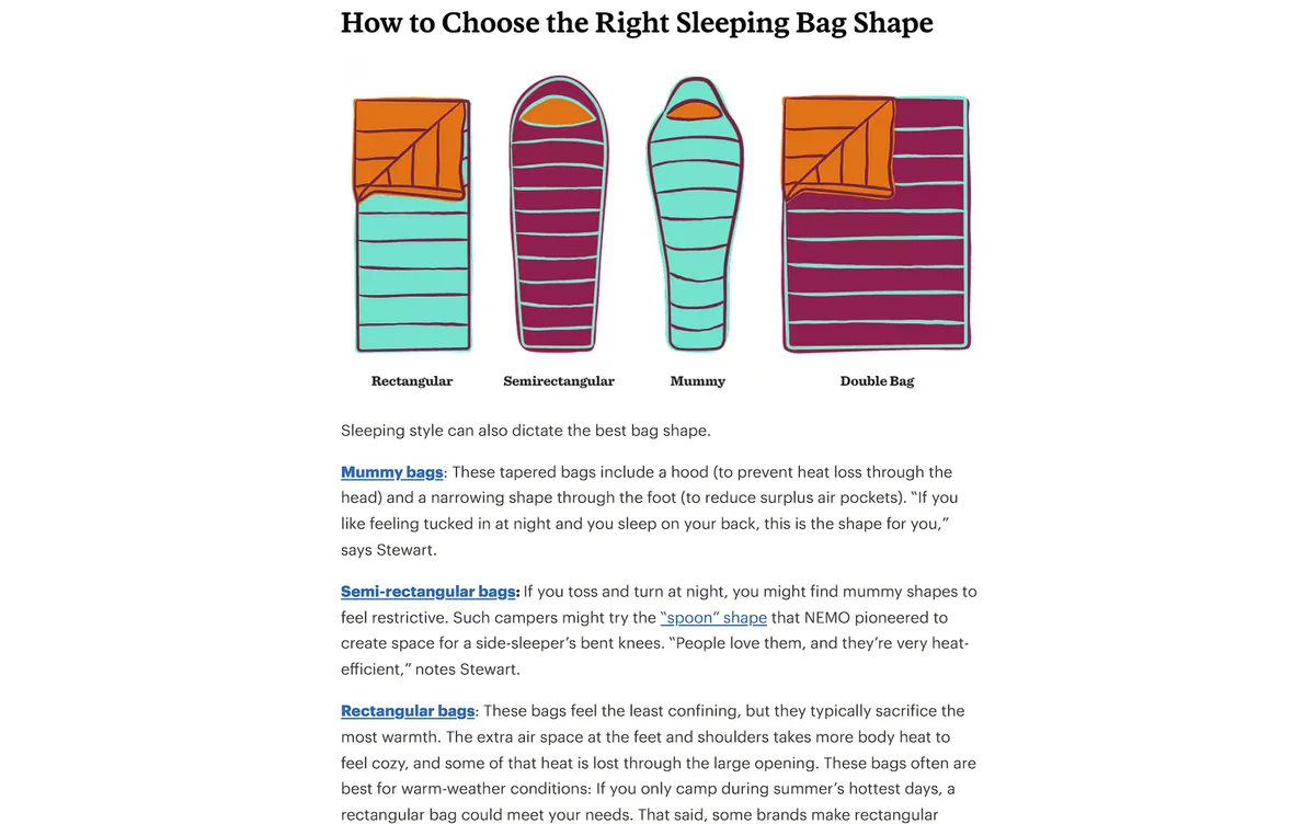
REI, a large retailer selling camping and hiking gear, uses this method in its “Sleeping Bags for Camping” guide.
The guide first separates car-camping sleeping bags from backpacking models based on factors such as intended use, weight, comfort, and cost. It then explains insulation choices, fit, shape, and temperature ratings, connecting each factor to real camping situations.
For example, REI explains that mummy bags suit back sleepers who like a tucked-in feel, while rectangular options can work well for people who move around or sleep on their sides.
This practical guidance helps shoppers understand which type deserves consideration before they choose a specific model. That makes category selection much easier.
Process Education Reduces Uncertainty Around Custom Purchases
Customized and made-to-order products raise many questions before a shopper buys. Customers can’t pick the item from a shelf, so they ask what they need to provide, who creates the design, how many changes they can request, and when the order arrives.
Unanswered questions make a custom purchase feel risky, and people often delay it. Process education answers them in advance.
Brands can map each stage of the purchase (submitting requirements, design development, revisions and approvals, production, and delivery). Each stage should state what the customer does, what the brand does, and how long it takes.
A clear process shows buyers that they keep control of the outcome until they approve it.
To implement this:
- Break your process into three to five steps and name each one in plain language.
- Add a time estimate and the customer’s task to every step.
- Show what buyers receive at each point, such as a sketch, a digital proof, or a physical sample.
- Explain how revisions work, including how many rounds you offer.
- State minimum quantities, shipping terms, and total lead time on the same page.
- Add photos of finished projects to show what the process produces.
- Link the page from product pages.
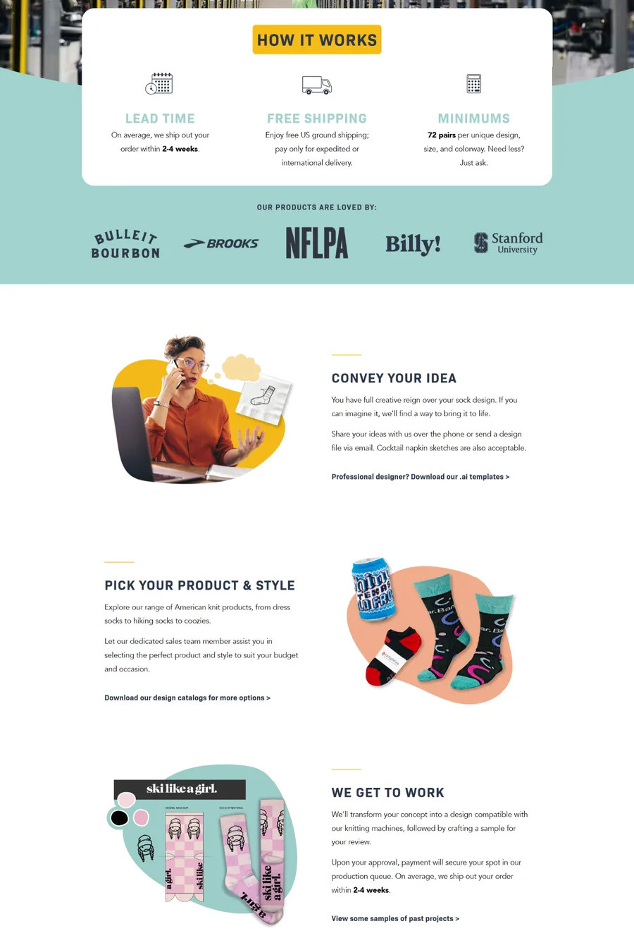
Custom Sock Lab, which sells custom socks for businesses and private use, presents this process clearly on their “How It Works” page.
This page explains that customers can begin with a finished design, a file, or even a rough sketch or verbal idea. They can then choose a product and style with help from the company’s sales team. Custom Sock Lab converts the concept into a design suited to its knitting machines and creates a sample for customer review.
This sequence shows shoppers how an idea moves toward a reviewed production sample, giving them a clear understanding of what they can expect throughout the project.
Product Roundups Support Product Discovery and Comparison
A large catalog gives shoppers choice and creates a sorting problem. Someone browsing hundreds of options needs a shortlist before they can compare details. A product roundup supplies that shortlist.
Effective roundups limit the selection to a manageable number, such as five to ten items, and explain why each one belongs on the list. Short descriptions can cover style, use case, compatibility, price, or a distinguishing feature, so shoppers understand how options differ. A consistent format helps, since readers scan each entry for the same details.
After reading, shoppers will know which two or three products deserve a closer look. They can then open product pages with fewer open questions and clearer personal priorities.
To implement this:
- Choose a ranking basis and state it, such as sales data, customer reviews, or editor testing.
- Limit the list to ten items or fewer.
- Give each entry the same elements (a photo, a two-sentence summary, three or four key features, available sizes or variants, and a link to the product page).
- Mention limitations honestly, such as a single size option.
- Organize separate roundups by use case, budget, or product type.
- Update lists each year so rankings stay accurate, and link them from category pages.
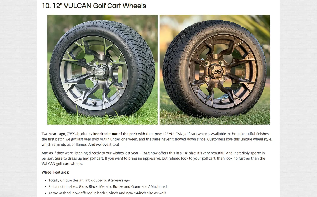
Golf Cart Tire Supply, a supplier of golf cart tires, wheels, and accessories, uses this format in its “Top 10 Golf Cart Wheels” post.
The roundup ranks ten popular wheel styles using recent and historical customer purchasing data. Each entry explains practical differences such as wheel size, finish, design, available variants, and suitable tire combinations. Some entries also explain fit considerations, such as sizes and applications for lifted or non-lifted carts.
This gives shoppers a manageable set of options while preserving useful product context, helping them decide which wheel styles deserve a closer look before visiting product listings. It also connects discovery with shopping decisions.
Visual Education Helps Shoppers Understand Features Before Buying
Specifications describe a product in numbers, and numbers rarely show how a product looks, fits, or works. Visuals show all three.
A photo beside a familiar object shows scale. A short video shows how an item assembles or operates. A close-up shows material and finish, and a lifestyle image shows the product in a realistic setting. Diagrams label features and mark the differences between models.
Placement matters, since 56% of shoppers check product images as their first action when they arrive on a product page. Those images set expectations before anyone reads a single word of copy.
Visuals chosen to answer specific shopper questions can often replace entire paragraphs of written explanation.
To implement this:
- List the questions shoppers ask most about each product, then match each question with a visual.
- Photograph items next to common objects and show them in use.
- Record short videos, under a minute each, that cover assembly and operation.
- Label diagrams with plain, familiar terms.
- Add captions that state what each image shows.
- Compress files so pages load quickly on mobile.
- Place videos near the buy button, where purchase intent peaks.
- Review customer questions every quarter and replace any visuals that don’t answer them.
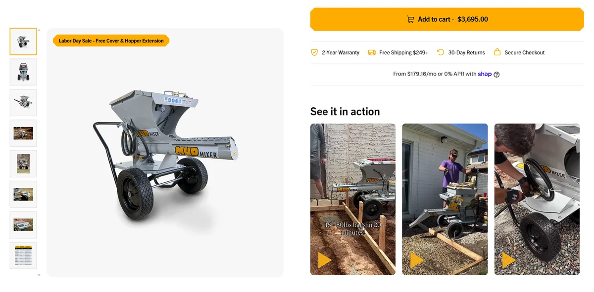
MudMixer, a brand selling portable and electric concrete mixing machines, uses visual education on its MudMixer Evolution product page.
Beneath the “Add to Cart” button, the page presents a video carousel framed as “See it in action.” Videos show the machine operating through demonstrations and job-site footage. They add context, helping shoppers see how the equipment works before committing to a purchase.
Placing this content at the point of highest purchase intent gives customers evidence while they’re deciding whether to complete checkout.
Final Thoughts
Pick one of your pages this week and read it as a first-time buyer would. Then, write down every question you’d want answered before buying.
Each question maps to a format covered above. Add the format that answers your most frequent question, then check returns and support tickets a month later.
The results will show which format your shoppers need next.
References
- Baymard Institute, Product Comparison UX: Always Provide Comparison Features for Spec-Driven Industries (2022)
- Baymard Institute, Product Page UX: Include Descriptive Text or Graphics for Some Product Images (2018)
Frequently Asked Questions
What is product education in ecommerce?
Product education is the information an online store gives shoppers so they can choose an item with certainty. It includes size guides, comparison charts, how-to videos, ingredient explanations and answers to common questions, placed where people make the buying decision.
Why does product education matter for an online store?
Online shoppers cannot touch or test a product or ask a store employee, so every unanswered question adds hesitation. Stores that explain their products clearly see fewer returns, fewer support tickets and more completed orders.
How many rows should a product comparison table have?
Four to six rows that reflect real buying decisions, such as size, compatibility, battery life and warranty terms. Write each cell in plain language, add units where numbers apply, and keep the row labels fixed while mobile users swipe sideways.
How many products should a product roundup include?
Ten or fewer. A roundup works as a shortlist, so limit it to a manageable number, state the ranking basis (sales data, customer reviews or editor testing), and give every entry the same elements so readers can scan them.
Where should product videos go on a product page?
Near the buy button, where purchase intent peaks. Keep each video under a minute and use it to show assembly or operation, so shoppers see how the product works before they decide.
How do I find out what my shoppers want to know?
Start with the questions your support team hears most, then add search queries, support chats and customer reviews. Match each frequent question to a format: a comparison table, scoring criteria, a use-case guide, a process page, a roundup or a visual.