How to Design Your Store for Maximum Conversion: a Beginner's Guide
On this page
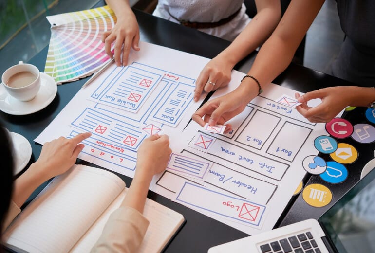
Building a Shopify store requires consideration of many factors. Luckily for you, we are here to help with the design guidelines! This blog post will summarize some tips and tricks for designing an online store on Shopify. We’ll cover design considerations for your Homepage, product page, checkout, and more to make it easier than ever before to build a successful shop from start to finish.
How to Pick the Right Theme for Your Shopify Store
To design your store, you first need to choose a theme. Shopify themes are self-contained design templates that come with their layout and design elements; they’ll help get your site up and running quickly while still allowing for customization as needed.
Don’t know which design theme to go with? We recommend choosing a design that matches your brand. An excellent way to do this is by asking yourself these questions:
– What’s the message I want my customers to understand about me and what I sell in my store?
– Who am I selling for or targeting with my design?
– What design style do I want to evoke with my design?
Once you have a design in mind, it’s time to add the theme. You can find and install themes within your Shopify admin or visit the Themes section of Shopify’s App Store on the web.
Shopify’s design team has created several themes that are pre-designed and easy to customize. They come with all the design elements, layouts, colors, fonts, etc., which you need for your store. You can also use these pre-made templates as inspiration to create your design from scratch without having to start from zero.
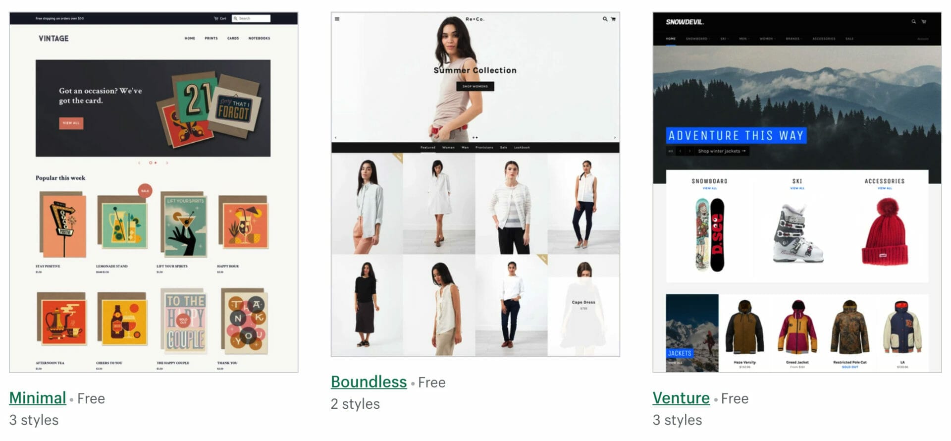
Themes are what give your store its design and layout; if you’re just getting started with Shopify design, we recommend using one of the default free themes that come bundled with every new Shop:
– Minimal theme
– Boundless theme
– Venture theme
– Simple theme
– Supply theme
– Brooklyn design
How to Design Your Store Homepage
Designing your Homepage is one of the most critical design elements for your store. This page will be the first thing customers see when they land on your site; it’s what sets up their expectations and mindset before viewing other parts of your design.
Below, you’ll learn design considerations for each section
– Header
– Navigation menu
– Call to action design element(s)
Header
The header is what captures your customers’ attention and draws them in. This design should outline or introduce the primary purpose of your site, either with a logo, image banner, slogan, or all three. Your design should also include any.
Navigation menu
The navigation menu design will let your customers know what they can do on the site. This design should include clickable links to all major website areas, including collections, categories, and sections for products within each section.
This design must be easy to navigate with clear labels and visual cues so that your customers can find their way around quickly without feeling overwhelmed or confused.
You also want a design where it’s quick and easy for you to edit as needed- some themes offer drag-and-drop editing, which makes it easier than ever!
Design considerations: Make sure that there are no hidden menus in your design; have them laid out clearly in an order people will understand without needing to think about how to go from one page to another. If you have a lot of pages, design your navigation menu so that it’s easy for customers to find what they’re looking for by putting links in order people are most likely to look first (i.e., collections before sections).
Logo design
A logo design can be a great way to showcase your design skills and brand. We recommend designing it with the following in mind:
– Keep it simple but unique
– Use colors that match or complement your store design’s palette
– Be sure you have a transparent icon so that customers know what company they’re looking at right away.
Logo design is one of the most important design decisions for any online store; think about how much time people spend looking at logos every day! A good graphic designer will make sure all these points are covered before working on anything else. This little detail could end up saving you money by ensuring everything matches from start to finish – not just here, but also across other areas of your design and branding.
Call to action design element(s)
The design of your call-to-action is what will determine how successful your store’s conversion rates are, so it’s important not to skimp on this detail! A good way to design a CTA design that grabs attention while still being subtle enough for customers who don’t want to be bothered with an offer at every turn:
– Incentives or discounts (e.g., free shipping)
– Bundling products together in offers or deals
– Promotions (x% off all items today!)
Keep these design considerations in mind when deciding which type of CTA you’ll use on your site – they can make the difference.
The Banner Image
A design that grabs attention and draws people in is important for any format, especially with an image banner. This design will be the first thing your customers see when they land on your site; it sets up their expectations about what to expect from you as a company.
This design should include:
– An eye-catching image
– A design with a clear message or offer about what you’re selling
Keep your design simple and to the point – customers will be quick to leave if they don’t have an easy understanding of what you want them to do.
Featured Collection
A design for your featured collection is a great way to showcase the unique qualities of what you’re selling, recommend the most popular or newest items to attract customer attention, and encourage them to purchase.
Along with this, your featured collections should be positioned within one row compared to other products similar in nature.
You can display your collections in a carousel and use more than 4-5 products.
The Exit Popup
An exit popup design is a great way to ensure that customers who are about to leave your site without making a purchase do so.
This design must pop up before they can exit, and it should include:
– An offer of an incentive (e.g., free shipping) or discount if they buy now
– A timer tells them how much time they have left until the deal expires; after 30 seconds, for example, try giving them another warning if some people don’t notice it right away!
This design element will help you convert more sales at the last minute and lure back potential buyers who might have been considering leaving. This design is one of the best ways to increase your sales.
Customer reviews

Customer reviews are one of the most important design elements on your site – they can help customers make more informed decisions about what they want to buy.
You can highlight any of these customer review design considerations:
– Positive feedback from happy customers in green font to emphasize their satisfaction with your store design (this is one of the most potent design features)
– Negative feedback from unhappy customers in red font to emphasize the design elements that need improvement (this is also an important design feature)
– The date of the review and a link to find more information about it
Adding customer reviews will help you convert potential buyers into repeat customers.
You can make your stores become more reliable to customers with LAI AliExpress Reviews. With LAI, you can import real reviews by real people to your online stores.
How to Design Your Product Page
The design of your product page is what will set the stage for visitors deciding to buy. Customers need to see all they need about a product while also being enticed by design elements that make them want it enough to take action and purchase it.
Hiring a graphic designer to upgrade your product pages can significantly improve the visual appeal and user experience. A skilled designer can ensure that your product images are professionally edited, your layout is aesthetically pleasing, and the overall design is cohesive with your brand’s identity.
This design should include:
- Photo of each product with a descriptive caption (let customers know what they can expect from the design)
- Product name and price
- Product description
- Social proof
- Size and color options, including a design that makes it easy for customers to choose the right size or design option.
- Add any other design elements, promotions, or special offers that will help visitors make decisions quickly about whether to buy now, later, or not at all.
How to Design Your Checkout

The design of your checkout page should be just as compelling and inspiring as the design on every other page. Below, you’ll learn design considerations for each section:
- Easy navigation, so people know exactly where they are at all times in the checkout flow.
- A design element that makes customers feel safe with a secure payment method like Secure Socket Layer (SSL) technology or our Shop
- Quick checkout process
- Shipping information including all delivery methods available, prices, etc., and ways to save money (e.g., free shipping with purchase of $100 or more)
- Shopping cart design includes how many items are in the customer’s shopping cart and a design element for adding another product.
- Confirmation design should include your header’s design elements and all information related to order delivery, such as packing slip design, tracking number design, etc.
Conclusion
Overall, design is key to the success of your store. Customers are influenced by design on every page, and design plays a vital role in conversion rates – there’s no denying it!
This blog post has taught you how to design each section of your Shopify theme for maximum conversions:
– Homepage design – Product Page design – Checkout Design
In addition, we’ve also touched upon exit popups as a way to increase sales at the last minute with incentives or discounts. We hope that this guide will help you make more informed decisions about which design elements work best for your eCommerce shop.
Frequently Asked Questions
How do you design your store for maximum conversion?
Designing for maximum conversion means giving careful attention to your theme, homepage, product pages, and checkout so every page guides customers toward a purchase. A clear header, easy navigation, strong calls to action, social proof, and a smooth checkout all play a role. Since design influences customers on every page, it is a key driver of conversion rates.
How do I choose the right theme for my Shopify store?
Choose a theme that matches your brand by asking what message you want to convey, who you are targeting, and what style you want to evoke. Shopify offers pre-designed, easy-to-customize themes that include layouts, colors, and fonts, and beginners can start with a free default theme. Picking a theme aligned with your brand keeps the whole store cohesive.
What should an ecommerce homepage include?
An effective homepage sets customer expectations from the first moment, so it should include a clear header, an easy-to-use navigation menu, and prominent calls to action. An eye-catching banner image with a simple message, a featured collection, and customer reviews strengthen it further. Keeping the design clear and uncluttered helps visitors understand what to do next.
What design elements make a high-converting product page?
A high-converting product page shows customers everything they need while enticing them to act. Include a clear product photo with a caption, the product name and price, a detailed description, social proof, and easy-to-use size and color options. Adding promotions or special offers helps visitors decide quickly whether to buy.
Why is checkout design important for conversions?
The checkout is where the sale is finalized, so its design should be as compelling and frictionless as the rest of the store. Easy navigation, a clearly secure payment method, a quick process, transparent shipping information, and a clean cart all reduce abandonment. A smooth, trustworthy checkout keeps customers from dropping off at the last step.