Product Page Perfection: How to Structure Ecommerce Pages for Maximum Conversions
On this page
The challenge of running an ecommerce business is that getting consumers to convert can be extremely difficult.
The trouble isn’t just an ever-growing availability of products, sometimes at very low prices, which is attractive to many people despite the trade-off in quality. The simple fact is that most shoppers are now browsing on their mobile phones, with data suggesting that 78% of all retail site traffic comes from such devices.
What this means is that your product page design has to be perfect to effectively communicate value. It needs to be engaging, look attractive on small screens, and still provide an enjoyable way for web visitors to collect product information without risking the possibility of them missing crucial info.
So, how do you achieve product page perfection? This guide will teach you how to structure ecommerce pages for maximum conversions, presenting you with proven-to-work tactics and inspiring examples you can implement into your site. Let’s get into it.
Ensure the Product Title Summarizes the Value Buyers Seek
No matter what anyone else tells you, the best way to ensure your product pages sell is to be super intentional with how you name your offer.
If they’re capable of communicating relevant value in an instant, your chances of making a sale will grow exponentially. However, if they’re not, well, then you can safely assume that your prospects won’t be as willing to convert.
Essentially, you have to remember that today’s web users have short attention spans and minimal amounts of patience. There’s even scientific research on the way speed affects purchase intent and price sensitivity, showing that appealing to consumers’ need for immediacy creates an effective strategy for business and profit growth.
So, if you want to engage your audience in an online space and effectively guide them toward a conversion, one of the best methods of doing so is to use the one part of your product page they’re guaranteed to look at — your product title — to instantly communicate value.
No, you don’t have to go into excessive detail to accomplish positive outcomes. Simple tactics such as highlighting key product characteristics — like Golf Cart Tire Supply does on its wheel and tire combo product page — can be enough to reassure potential customers that they are in the right place to resolve their pain points.
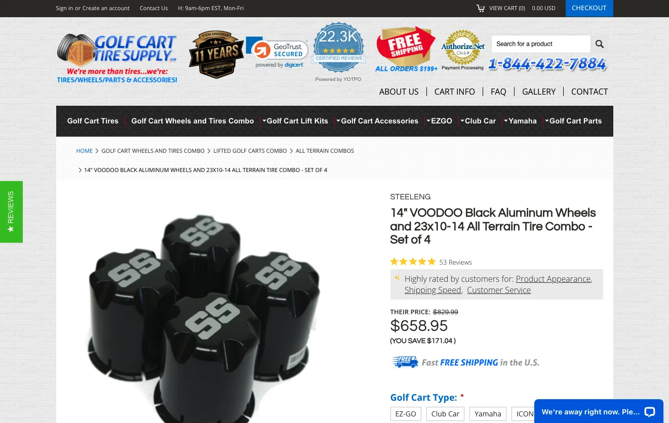
Source: golfcarttiresupply.com
Invest in Exceptionally High-Quality Visuals
The second most important element of a high-converting product page is the section that contains product visuals.
Ultimately, product photos are an irreplaceable factor in the digital buyer’s journey.
According to research, 75% of shoppers rely on product photography to make their purchasing decisions. Even more impressively, studies suggest that the quality of your product visuals directly influences web visitors’ brand perception, purchase intent, and price sensitivity. This proves that the right visuals can not only help you boost conversions but also elevate profits.
Of course, traditional product photography is an amazing investment if you’re aiming to boost product page conversions. However, if you want to go above and beyond, consider also showcasing product videos and user-generated content about your products — like the videos embedded on the Rollr Deodorant product page.
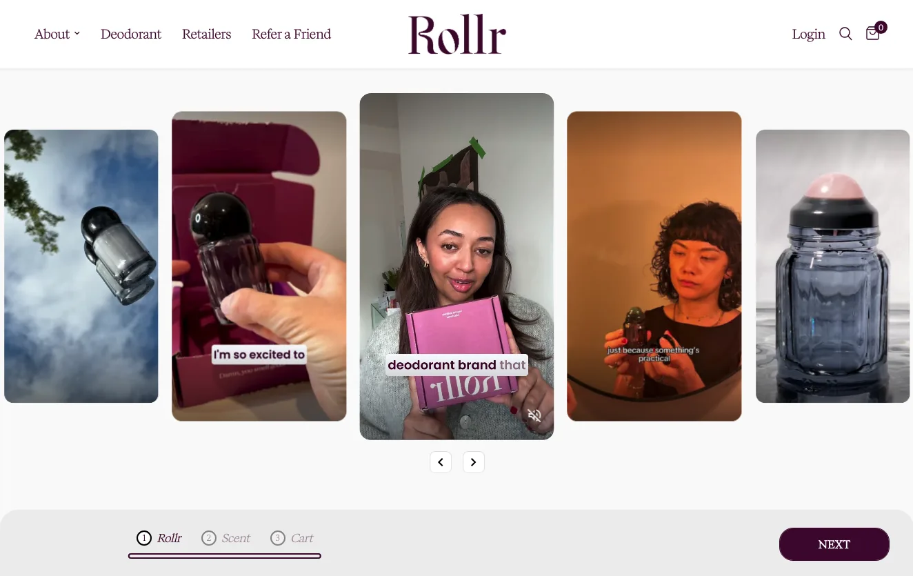
Source: rollr.co.uk
These formats aren’t just attractive and trust-building. They’re also effective at elevating product understanding, which is one of the prerequisites for a heightened purchase intent.
Show Some Social Proof High up on the Page
Convincing web visitors to turn into customers requires a high level of brand trust. After all, credibility is a top-three purchase factor for consumers in 2025. And almost all consumers now seek out social proof before making a buying decision.
But here’s the deal. Many businesses struggle with incorporating social proof into their product pages because they think they need to show off all of it right at the top of the page. And, sure, this approach can offer some benefits. However, it can be equally overwhelming for your audience — especially if they’re not ready to convert yet.
So, what’s the best way to earn customer trust on product pages without making it seem like you’re forcing prospects toward a purchase?
Well, a good compromise could be to show some (basic) social proof high up on the page. Then, save the rest of it for the bottom section of the product page. This part is likely only going to be viewed by shoppers genuinely interested in buying and people who want to check user feedback when evaluating your offer.
For instance, if you take a look at the Custom Sock Lab Classic Cotton Athletic Socks product page, you’ll notice that the first piece of social proof is located right below the product title. And, for engaging potential customers, that’s more than enough. Then, the brand carefully distributes additional instances of social proof (including client logos and customer reviews) throughout the rest of the page, using that info as additional selling points — not as overtly sales-oriented elements that might come off as aggressive to awareness-stage consumers.
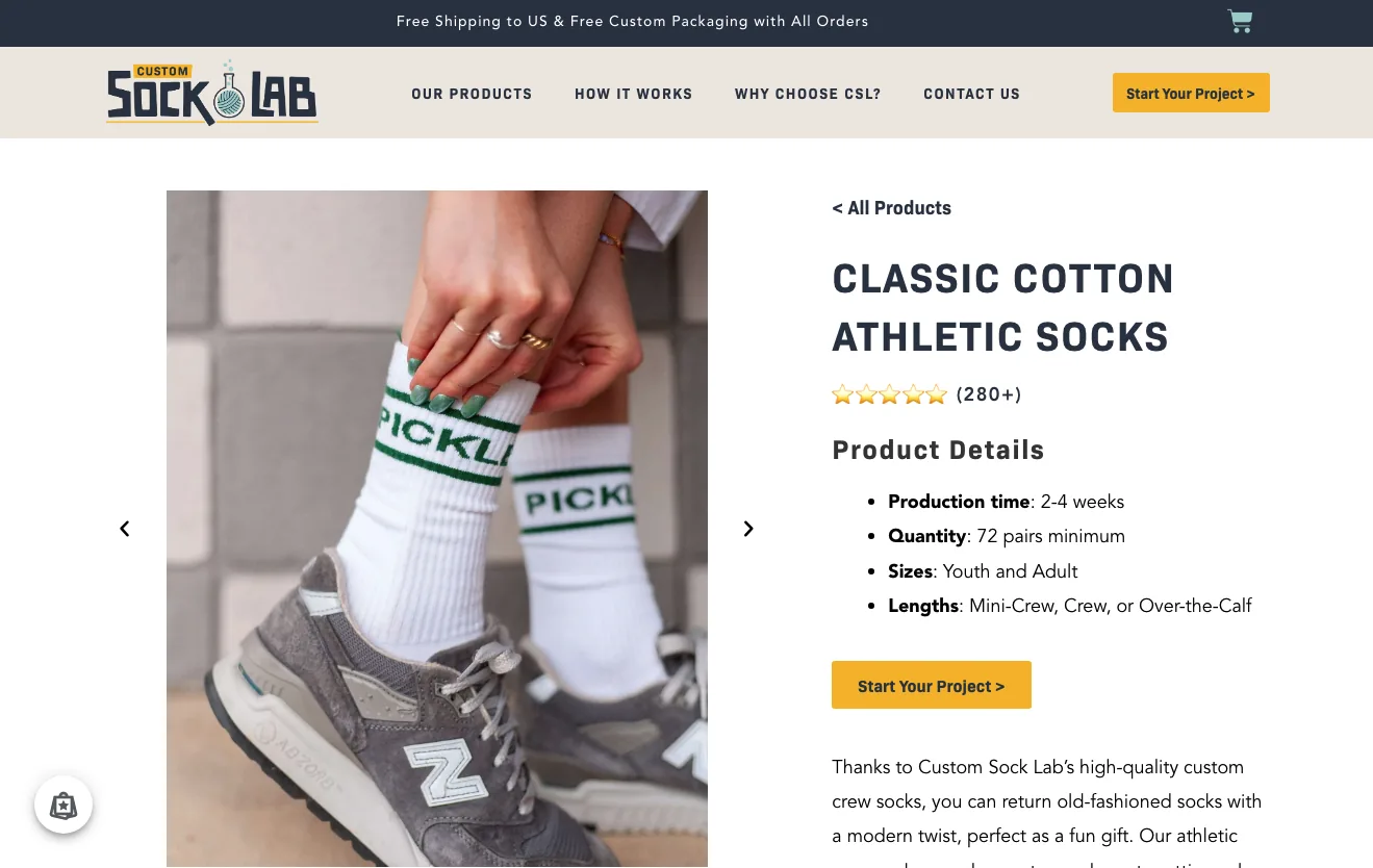
Source: customsocklab.com
Don’t Be Afraid to Go Into a Ton of Detail About Your Offer
We’ve mentioned that today’s consumers don’t have much patience with online content. And if you expect them to read about your offer on your website, you can practically forget about it — unless they’re really determined to resolve a pain point.
After all, research suggests that almost 80% of people don’t read online content word-for-word. Instead, most people choose to scan pages for bits of information that they find interesting or relevant.
However, the fact that most consumers aren’t that willing to take a deep dive into product evaluation shouldn’t stop you from providing sufficient detail about your offer for those shoppers who are a bit more critical. You just have to explore opportunities to present your target audience with a ton of product details in a way that’s relevant to their experiences and easy to consume (without causing informational overwhelm).
Mind Lab Pro, for instance, strikes just the right balance between accessibility, ease of understanding, and depth of information. If you take a look at the main product page’s structure, you’ll find that it includes extensive info about supplement facts, ingredients, allergy advice, instructions, and expectation-management content. Additionally, the page summarizes some of the primary benefits of the brand’s unique formula. There’s plenty of social proof and verifiable data to back the brand’s claims.
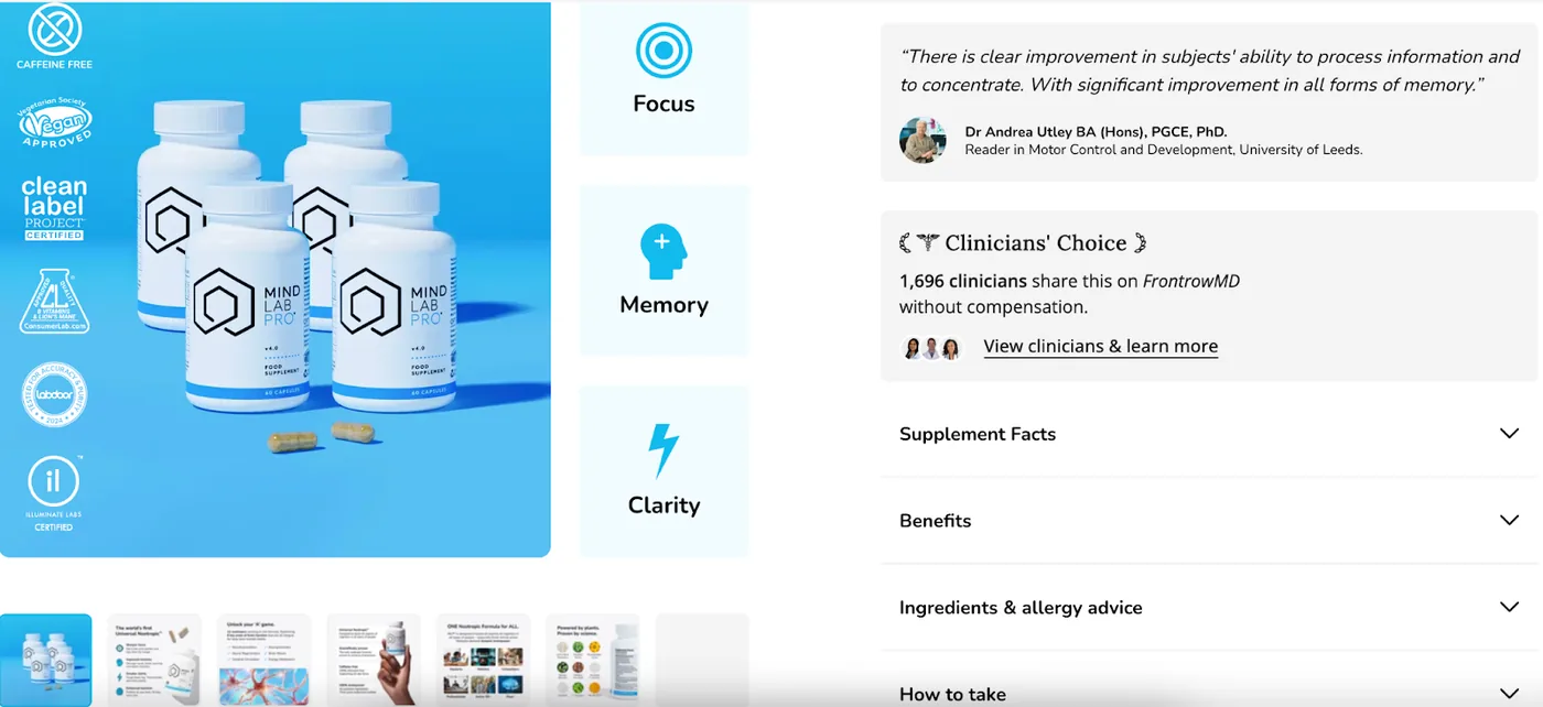
Source: mindlabpro.com
Employ Cash Flow-Optimization Tactics for Maximum Profits
When exploring ecommerce product page optimization tips for boosting conversions, most business owners focus on activities that aim to convince shoppers to click the “Buy” button.
But here’s the deal. True business success isn’t achieved by selling a product once. Instead, the key to growth is to earn your customers’ loyalty and to convince them to spend more in your online store. That way, you can optimize your cash flow (giving you a higher budget for investing in business growth marketing tactics). Plus, you can improve your customer lifetime value — which means your cost of acquiring new customers goes down compared to only selling to each buyer once.
So, what are the best tactics to help you accomplish these goals?
For starters, you need to structure your ecommerce product pages in a way that encourages re-purchasing. Promoting subscription options with savings incentives is one of the easiest methods to accomplish this.
Additionally, don’t forget to encourage web visitors to buy more than one product while browsing your ecommerce store. You can do this with traditional cross-selling product page elements. Or, you can do what Smith Tea does on its Lord Bergamot product page and include a free shipping calculator in your cart pop-up that encourages buyers to spend more to unlock sought-after CX benefits.
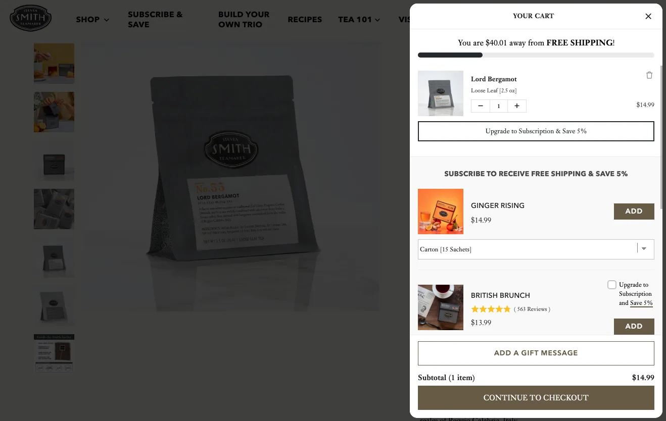
Source: smithtea.com
Highlight Convenience Near the Main CTA Button
As you explore opportunities to achieve product page perfection through structuring your online presence for maximum conversions, it’s crucial to remember the key drivers that influence consumers to convert.
According to research from 2024, 77% of shoppers want brands to provide them with convenient buying experiences — ones that provide comfort, speed, accessibility, and availability. And many are even willing to spend extra for such benefits.
So, if you want to ensure your target audience feels comfortable spending their hard-earned money in your ecommerce store, explore ways to highlight the fact that buying from your business gives consumers the type of convenience they seek.
Sewing Parts Online, for example, uses this tactic on its Snap On Presser Feet Set product page, where it communicates that the product is “In stock and ready to ship,” as well as that buyers get fast free shipping on all USA orders over $49, that there’s a 60-day returns period, and that the brand offers a price match guarantee to maximize customer satisfaction.
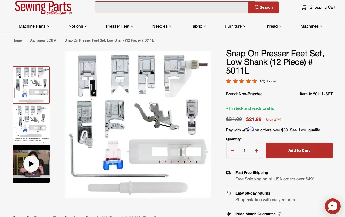
Source: sewingpartsonline.com
Remove Common Conversion Obstacles with Trust Badges and Microcopy
Last but not least, keep in mind that a typical buyer’s journey inherently includes some conversion obstacles.
After all, with 70.22% of add-to-cart conversions ending in abandonment, it’s evident that most shoppers have some risk aversions stopping them from completing their purchases.
In most cases, these can include a lack of brand trust, low purchase intent, or unsatisfactory customer experience benefits (like slow or expensive shipping).
However, there are situations in which your target audience’s main reason for not buying boils down to a lack of assurance on your part.
The good news is that you can easily fix this with trust badges and microcopy, placed strategically throughout your product pages (particularly in areas where web visitors are most likely to have to make a purchase decision).
For instance, Hydrapak emphasizes its Beyond Lifetime Guarantee on the Mountain Stow product page, knowing that product quality and durability are top priorities for its target audience, who want the best of the best from their gear.
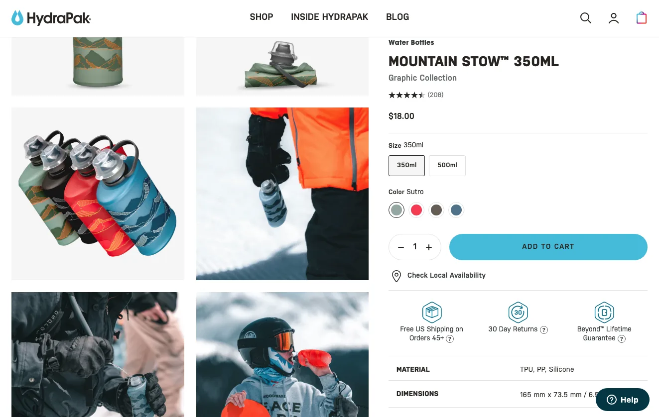
Source: hydrapak.com
Final Thoughts
As you can see, there are multiple strategies for structuring your product pages to maximize conversion rates. And the exact tactics you choose to implement on your site will hugely depend on your target audience’s behavior and the areas where your ecommerce store underperforms.
Naturally, no matter which of the strategies you decide to go with, the best thing you can do is play around with it. Adopt a “basic” version, see how it performs, then explore ways to upgrade it for more sales. That way, you won’t just ensure a higher CR for your business. You’ll also avoid the hidden pitfalls of a full-out product page redesign that could confuse your existing customers or cause unexpected bugs and mistakes that could get you further from your goal (instead of helping you reach it more quickly).
Frequently Asked Questions
How do you structure ecommerce pages for maximum conversions?
Structure a high-converting product page so it communicates value instantly and removes friction. Use a product title that summarizes the value buyers want, lead with high-quality visuals, place some social proof high on the page, give detailed product information for critical shoppers, and put trust badges plus convenience messaging near the main call to action.
Why is the product title so important on an ecommerce page?
The product title is the one element shoppers are almost guaranteed to read, so it should communicate relevant value in an instant. Today's web users scan rather than read in full, so a title that highlights key product characteristics reassures buyers they are in the right place.
How many images should a product page have?
There is no single fixed number, but product visuals are one of the most important conversion elements and most shoppers rely on product photography to make purchasing decisions. Beyond standard photos, adding product videos and user-generated content can deepen product understanding and build trust.
Where should social proof go on a product page?
Place some basic social proof high on the page, then distribute the rest lower down for shoppers who are genuinely ready to buy. Showing all of it at the top can overwhelm visitors who are not ready to convert yet, so a staggered approach works better.
What are trust badges and how do they help conversions?
Trust badges and short reassuring microcopy are small signals placed where shoppers make purchase decisions, near the cart or call to action. They reduce common conversion obstacles like uncertainty about security, returns, or shipping, which helps recover hesitant buyers.