The Power of White Space: Streamlining Your Ecommerce Site for Better UX

On this page
Investing in UX design is crucial for ecommerce businesses.
Sure, ecommerce web usability and conversion rates may not be overtly related. But the fact is, your target audience is guaranteed to judge your business based on how much they enjoy interacting with your site.
If you look at the research, you’ll find that poor UX significantly harms your ability to convert new customers. Google discovered that slow load speeds increase bounce rates by as much as 123%. Moreover, Adobe’s research revealed that 65% of people want brands to deliver enjoyable web viewing experiences regardless of the device they use to consume content.
Naturally, there are many ways to provide web visitors with better UX. However, in most cases, the solution could be as simple as using the power of white space.
Without further ado, here’s how you can use negative space to streamline your ecommerce site for better UX and higher conversions. Let’s get into it.
What is White (or Negative) Space?
Most web design advice focuses on where and how to use various elements to ensure maximum engagement and conversion rates. And that makes plenty of sense — at least until the final result turns into an impossible-to-navigate maximalist mess.
For some web designers, the logical solution to the obstacle of overwhelming web design that doesn’t convert comes as minimalist aesthetics. And, in some ways, this makes sense.
Minimalist web design is highly predictable (making these sites easy to use). Furthermore, the pared-down looks allow designers to emphasize high-value web page elements, including value propositions, CTAs, and trust signals.
Nevertheless, while you can choose such a direction for your brand’s digital presence, you don’t have to. Instead, all you have to do is use sufficient white space throughout your website.
But what is white space, exactly?
The easiest way to define white (negative) space is to say it is any “empty” area between or within web design elements.
What’s important to understand is that it doesn’t necessarily have to be white. It can be a color, texture, pattern, or image — like in the example from Mannequin Mall below, where the brand uses low-opacity product imagery instead of white space. However, it does have to play the role of visually housing, separating, and emphasizing the web components it surrounds.

Source: mannequinmall.com
How Can You Use White Space to Improve Ecommerce UX?
Incorporating white space (or using it more intelligently) into your website is relatively easy. Yet, it can yield impressive results — especially if you focus on ways it can enhance the user experience and boost your business results.
Elevating Engagement Rates
One of the most prominent benefits of enriching your website with negative space is that it can positively impact engagement rates.
Essentially, this is because it actively draws attention to the elements it surrounds.
Now, you may feel like color, contrast, typography, and imagery are sufficient, on their own, to make your value propositions pop. But you must understand that today’s consumers have shockingly short attention spans.
According to the American Psychology Association, the average adult only has a 47-second attention span. That means you’ve got less than a minute to grab their attention, communicate your value proposition, and convince them to take further action. In many cases — and particularly when you sell complex solutions — this can seem impossible.
The way white space can help is that it can draw your web visitor’s attention to the website elements you want them to notice. Moreover, it can reduce distractions around those elements, ensuring your prospects pay more attention to these messages.
One of the best examples of how white space can maximize engagement comes from Cadence. This brand understands that it sells a unique and innovative product. So, to ensure it can hold its audience’s attention while it explains the pros of its travel containers, it surrounds the main explainer video with plenty of white space. This guarantees that shoppers only see the information crucial for their product understanding. It maximizes their engagement rates. Finally, it improves their chances of identifying Cadence’s solutions as the answer to their pain points.
Highlighting High-Value Conversion Elements
Another spectacular way to use white space to streamline your website and make it more usable is to guide user attention.
Essentially, if there is an element you want your web visitors to notice — perhaps a call to action button — you can make it pop against the surrounding elements by encompassing it with sufficient negative space.
For instance, check out how Bay Alarm Medical does it in the hero section of its homepage. In addition to using an attention-grabbing red color for its primary CTA, this brand also ensures there is enough negative space around the “See Plans” button. This results in a prominent signal regarding what step web visitors should take next. Plus, it creates a clear association between the color red on the website and the resolution of Bay Alarm’s prospects’ ain points.

Source: bayalarmmedical.com
You could, of course, adopt the same strategy to emphasize different elements. For instance, knowing how important credibility and brand trust are for inspiring conversions, why not use white space to make your social proof more easily noticeable?
The reviews section on the Areaware homepage presents the perfect example of this UX design strategy in action. Why? Because the site employs a colorful and complex visual aesthetic. However, the negative space around the customer feedback encourages web visitors to pause their scrolling, read the reviews, and consider whether the mentioned benefits could be something that would make a positive impact on their lives.
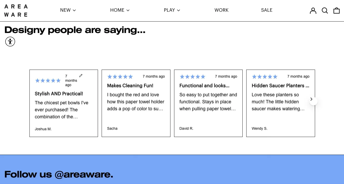
Source: areaware.com
Boosting Website Accessibility
Did you know that most websites perform poorly in being accessible and user-oriented? According to the latest data from WebAIM, nearly 95% of all websites had at least some accessibility failures in 2024.
And while accessibility may not seem that important to you, it has a real impact on website usability and audience reach.
For starters, investing in accessible web design isn’t just about being compliant with rules or inclusive. It can also prevent you from making your site unusable to entire segments of your audience. Plus, accessible websites rank higher on SERPs, achieve better reach, and positively affect brand reputation.
All in all, website accessibility is good for business. And white space could be the key to reaping its benefits.
For starters, incorporating more negative space into your UX design could prevent frustrating web usability interactions like accidental clicks.
If you check out the Kinfield homepage, you’ll see that the ample room between different elements makes it super easy for users to browse and interact with the website — regardless of the device they’re using or the size of their screens. (It’s also worth noting that this brand allows web visitors to adjust viewing and accessibility settings to ensure they have the best browsing experience.)

Source: kinfield.com
Another notable accessibility benefit of surrounding web design elements with negative space is that it can create the needed separation between products, product categories, or services.
For instance, check out the OrthoBracing homepage. This brand’s UX design features separated product category cards, making it easy for buyers to choose the type of solution they want and need.
Sure, the white space in question isn’t white but a visual. However, that design choice only helps OrthoBracing’s mission, seeing that it aligns category names and CTAs with a straightforward visual representation of what each product type does. This approach is particularly beneficial when trying to sell complex solutions to non-expert buyers.
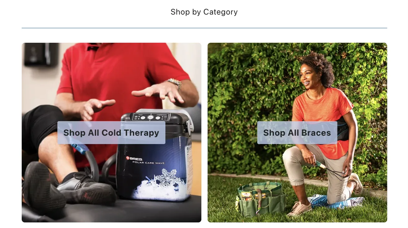
Source: orthobracing.com
Speeding Up Website Navigation
How long is the typical buyer’s journey? In most cases, it takes multiple brand touches between your prospects first learning about your brand and products and turning into customers.
The reason for this is simple. Nowadays, buyers prefer to do at least some product research before committing to a purchase. Why? Because they want to get the best possible value for their hard-earned money.
To do this successfully, they will (probably) need to browse your website until they’ve found a solution that aligns with their needs. Meanwhile, you need to harness the power of website UX design to ease and speed up navigation. And what better way to do this than with negative space around your navigation menu?
If you look at the Sewing Parts Online homepage, you’ll quickly realize how big of a selection of items this brand sells. But what’s great about its approach to UX design is that it makes product discovery super simple. In addition to the highly functional search function in the hero section of the page, Sewing Parts Online also uses white space to make web navigation a breeze. With ample space around each product category, users can quickly find and zoom in on relevant product types. And they can easily click through to their wanted product collection pages, making the shopping experience hugely satisfying.
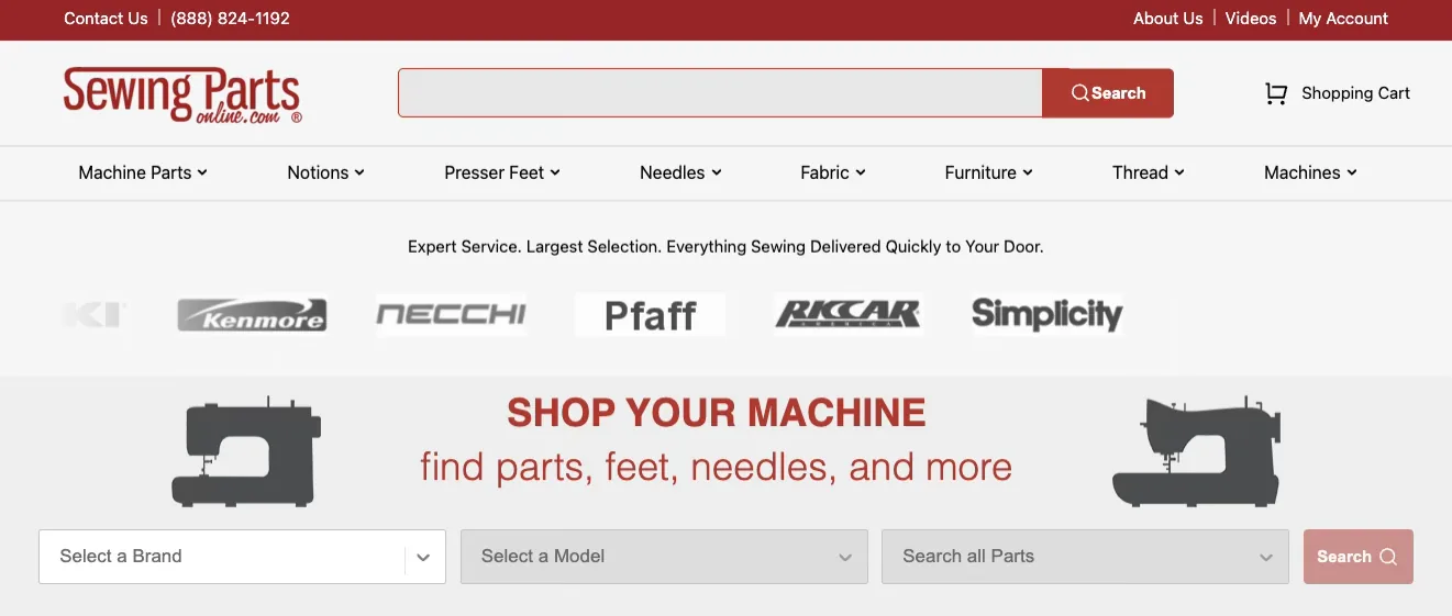
Source: sewingpartsonline.com
Elevating Website Readability and Content Comprehension
Finally, if you want to harness the power of white space to streamline your ecommerce website, don’t forget the role the web element can play in readability and comprehension.
Research shows that more spacing between text not only makes reading easier but also significantly boosts content comprehension.
Now, this may not seem that important in an ecommerce setting. But the truth is, consumers must understand what benefits your products offer to be willing to spend their money on your solutions.
With this in mind, explore ways to incorporate more white space into your website content.
For your homepage, landing pages, or product pages, think of methods to create more separation between page elements. The Caraway homepage is a great example, as it uses ample padding to ensure web visitors comprehend each of the unique benefits its solutions offer.
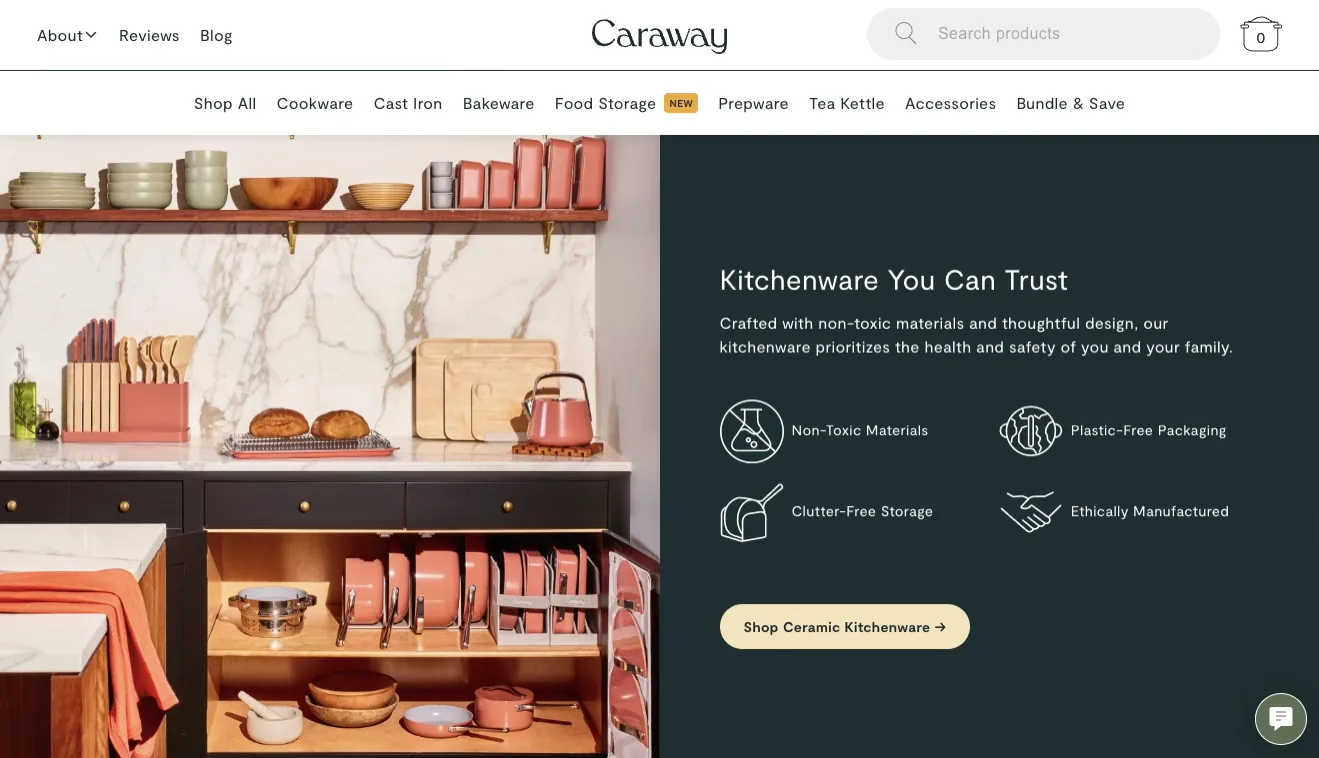
Source: carawayhome.com
As for your product pages, white space can be super effective at making product descriptions and features pop. If you look at the Moooi website, you’ll see that it adopts a minimalist web design approach with lots of negative space. This means that each unique value proposition (like the 5-year warranty) stands out. Plus, it makes it easy for web visitors to read and immerse themselves in the product descriptions, which makes them much more likely to want to invest in the brand’s offer.
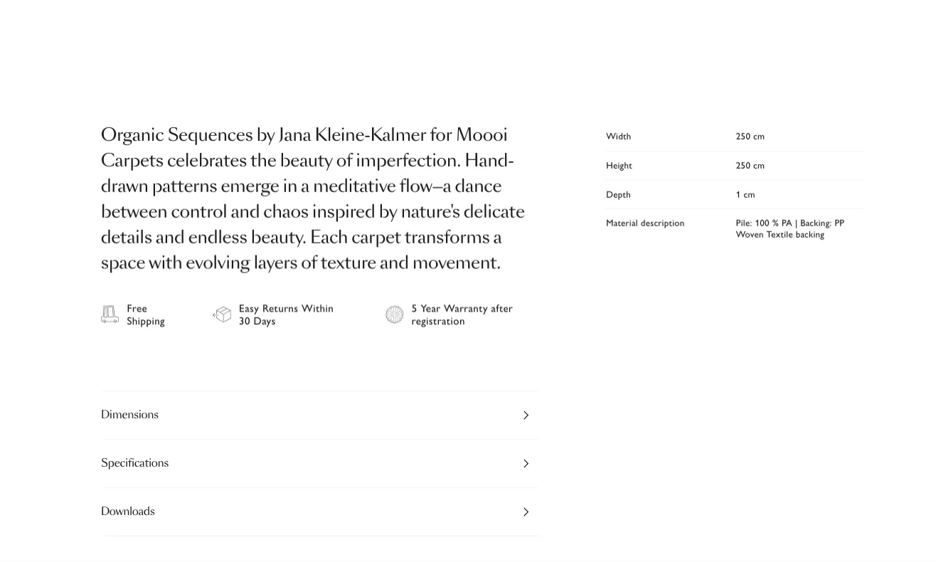
Source: moooi.com
Final Thoughts
Using white space to streamline your site’s UX design is a simple yet high-ROI strategy.
So, if you want to elevate the attractiveness and user-friendliness of your site, explore opportunities to surround key web page elements with more negative space.
Remember, you don’t have to go overboard. Even just a bit more padding can be helpful in capturing and guiding web visitors’ attention and making it easier for them to comprehend the value your ecommerce brand offers.
Frequently Asked Questions
What is the power of white space in ecommerce web design?
White space, also called negative space, is any empty area between or within design elements, and it streamlines an ecommerce site for better UX. It draws attention to key elements, reduces distractions, and makes pages easier to read and navigate, which can lift engagement and conversions.
Does white space have to be the color white?
No, white space does not have to be white. It can be a color, texture, pattern, or even a low-opacity image, as long as it visually houses, separates, and emphasizes the elements around it.
How does white space improve ecommerce UX?
White space improves UX by guiding user attention to high-value elements like calls to action and reviews, reducing accidental clicks, and separating products or categories. It also speeds up navigation and boosts readability, since more spacing between text makes content easier to comprehend.
Can white space make a website more accessible?
Yes, adding white space can make a site more accessible and easier to use. Ample spacing between elements helps prevent frustrating interactions like accidental clicks and creates clear separation between products and categories, which is especially helpful on small screens.
Do I need a fully minimalist design to use white space?
No, you do not need a minimalist design to benefit from white space. You can keep a colorful or complex aesthetic and simply add more padding around key elements, since even a bit more negative space helps capture and guide attention.