Why Good UX Pays Off: Boost Ecommerce Conversions with Smart Design

On this page
A lot of ecommerce businesses overlook user experience. They focus on ads, traffic, and pricing, and ignore how people actually use their site.
In reality, if your store is hard to navigate or slow to load, most people won’t stick around long enough to buy. A clean, well-designed site looks better and works better. It helps people find what they’re looking for faster and guides them towards checkout with less friction.
That’s where the payoff is. We’ve seen businesses increase their conversion rates by up to five times just by improving the user experience. And no, you don’t need a massive budget to make meaningful changes. The answer lies in smart decisions – tweaking layouts, speeding up pages, removing unnecessary steps, etc. If your site feels easy to use, people will buy more.
This article breaks down how good UX pays off and what changes are worth your time.
Reducing Friction by Giving Visitors What They Want
When someone visits your ecommerce store, they’re on a mission. They want to find products, compare options, and check out. They want all of this without unnecessary roadblocks. Every extra click or confusing navigation choice creates friction that drives potential customers away.
Data backs this up. 77% of consumers prefer businesses that approach them in a proactive and personalized way.
The most successful ecommerce sites anticipate what visitors need and make it immediately accessible.
Here’s how to implement this approach:
- Use clear, simple navigation. No one wants to hover over five dropdowns to find a product.
- Place your most popular products or categories prominently on your homepage.
- Install a smart search function that predicts what customers are looking for.
- Create category structures that match how customers naturally think about your products.
- Design clear, direct paths to checkout with minimal steps.
You don’t need to guess what people want. Check your analytics. What are your most visited pages? What do users search for the most? Use that data to shape your homepage and key landing pages.
A solid example of this strategy is Business For Sale, a marketplace for buying and selling established businesses in Australia. Their homepage immediately presents visitors with a streamlined search interface. You just need to select the business type and location to instantly access relevant listings.
This design recognizes that visitors come with specific criteria in mind and don’t want to wade through irrelevant options.
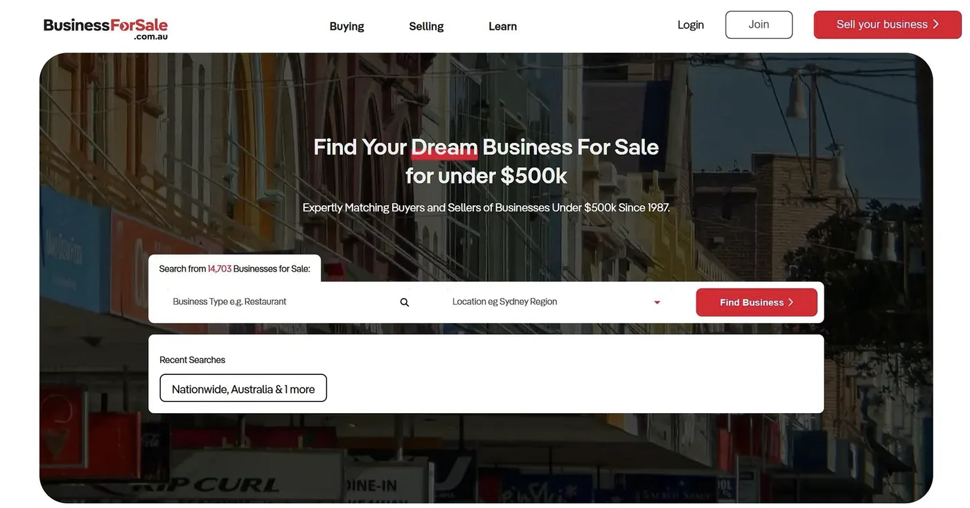
Source: Businessforsale
The results speak for themselves. By cutting out unnecessary steps, you keep shoppers happy and increase the chances they’ll convert.
This upfront design choice saves time, removes confusion, and keeps users moving in the right direction. It’s a small UX detail that plays a big role in turning visitors into leads.
Motivating Customers with Smart Incentives
Not every visitor shows up ready to buy. Some are browsing, and some are just comparing. Smart design gives those people a reason to take the next step.
Whether it’s a discount, a limited offer, or a clear callout, your site should make it easy for both new and returning customers to feel like now is the right time to buy.
This matters more than most store owners realize. 67% of consumers have made a purchase they didn’t plan to, just because they found a coupon or discount. That has little to do with impulsive behavior – it’s more about motivation. A well-placed offer can often tip the scale.
Here’s how to implement this approach:
- Design clear visual hierarchies that highlight special offers without overwhelming your core products.
- Create time-sensitive offers with countdown timers to create urgency.
- Show savings amounts in actual dollars rather than just percentages.
- Place strategic exit-intent pop-ups that appear when customers are about to leave.
- Make discount codes easy to apply with one-click functionality.
- Test different incentive types. Free shipping often outperforms percentage discounts.
Timing matters, too. Offer different incentives to first-time visitors versus returning customers who abandoned carts.
Nerdwax, which sells specialized wax products that prevent glasses from slipping, executes this brilliantly. Their homepage prominently features collections with sale items, making discounted products immediately visible to visitors.
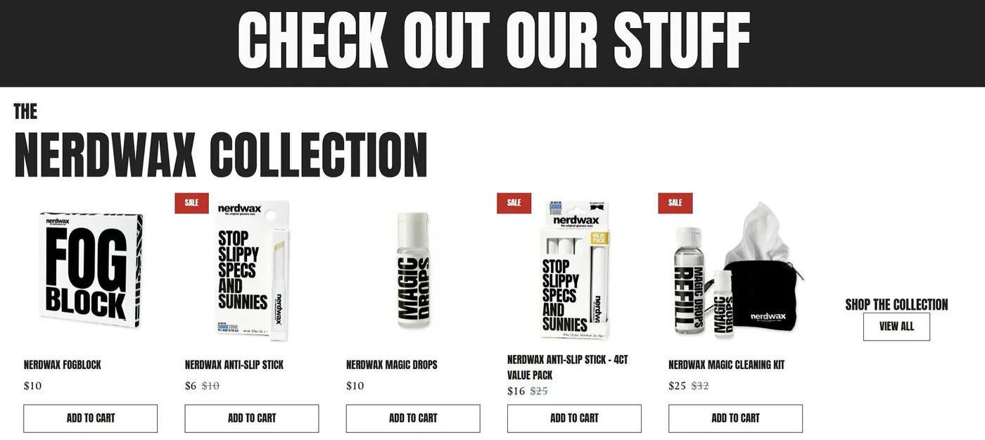
Source: Nerdwax
They’ve also implemented a strategic pop-up offering 15% off in exchange for an email address. That’s a fair value exchange that builds their marketing list while giving customers immediate savings.
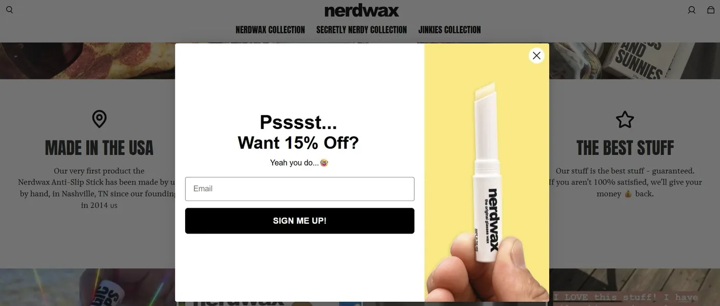
Source: Nerdwax
What makes Nerdwax’s approach particularly effective is how seamlessly these incentives integrate with their overall design. The offers feel like helpful suggestions rather than desperate attempts to close sales.
If you track conversion rates before and after implementing these design elements, you can easily confirm that your strategic incentives significantly boost both first-time purchases and customer lifetime value. That can be your proof that smart UX decisions directly impact revenue.
Showing That What You Sell Actually Works
Potential customers need reassurance before trusting your ecommerce store with their money. Smart design incorporates proof of your effectiveness directly into the user experience.
According to recent marketing research, case studies ranked as the number one most effective marketing tactic to increase sales in 2024. This is hardly surprising for us. When customers see concrete results others have achieved, they can imagine similar outcomes for themselves.
The challenge lies in presenting these success stories without disrupting the shopping experience.
Here’s how to implement this approach:
- Create a dedicated section on your homepage that highlights key metrics and outcomes.
- Design case study snippets that communicate results in five seconds or less.
- Include specific numbers and percentages rather than vague claims.
- Use real customer photos alongside testimonials to increase credibility.
- Make full case studies accessible with a single click for interested prospects.
- Rotate featured success stories to showcase different use cases and industries.
- Always prioritize relevance. Showcase results that align with what your target customer wants to achieve.
RapidDirect, a rapid CNC prototyping company, implements this strategy perfectly. Their homepage features a dedicated section with concise case study snippets showing the results their clients achieved. Each snippet highlights a specific industry that might matter to their target audience.
Visitors can click through to access complete case studies detailing how RapidDirect’s manufacturing capabilities solved specific client challenges. This approach lets casual browsers quickly grasp RapidDirect’s value while giving serious prospects deeper information to support their decision-making.
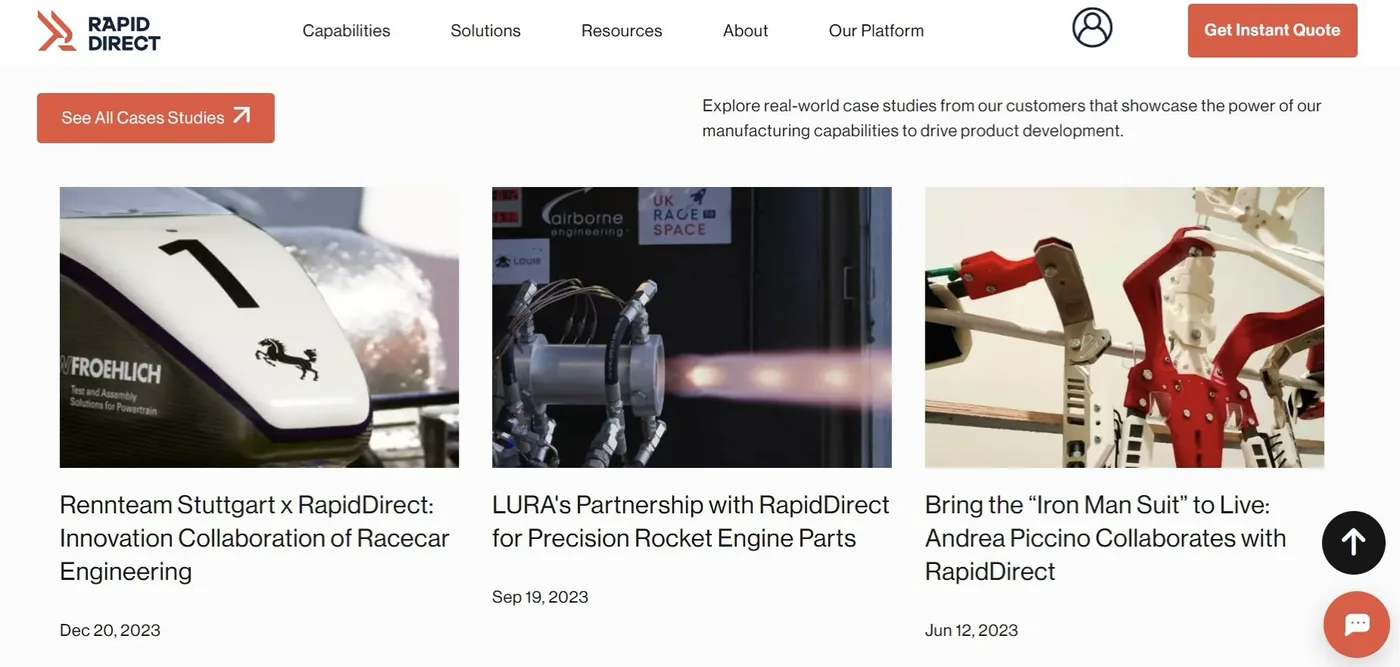
Source: Rapiddirect
The impact on their business has been substantial. Featuring these concrete results rather than generic claims has helped RapidDirect increase their quote requests and shorten their sales cycle.
This method transforms websites from simple catalogs into persuasive sales tools that actively convert visitors.
Preventing Frustration with Instant Customer Support
When shoppers hit a roadblock during their purchase journey, the difference between abandonment and conversion often comes down to how quickly they can get help. Smart ecommerce design anticipates questions and provides immediate support at critical decision points.
Recent customer service data confirms this approach works. Most customers now rate chatbots as effective or very effective at resolving their issues, particularly for straightforward questions that would otherwise create purchase friction.
The key is implementing support features that feel helpful rather than intrusive.
Here’s how to implement this approach:
- Position chat widgets in the bottom corner where they’re accessible but not disruptive.
- Program chatbots to answer common questions about shipping, returns, and product details.
- Design clear escalation paths for human agents when questions become complex.
- Add contextual help icons next to potentially confusing elements like sizing charts.
- Create a visible support presence on high-value pages or sections like checkout and product details.
- Use proactive triggers based on behavior (like dwelling on a page or abandoning the cart).
Remember that balance is essential. Support should feel available without feeling like you’re being watched.
HUM Nutrition, which offers subscription-based vitamin and supplement products, is brilliant in this regard. Their always-available live chat system handles everything from subscription cancellations to product recommendations.
What makes their implementation particularly effective is how they’ve blended automation with human support. Their chatbot efficiently processes routine requests like cancellations and order status updates, freeing human agents to focus on nuanced pre-sale inquiries about supplement interactions or personalized recommendations.
In the health and wellness space, where customers often have specific questions about ingredients and effects, this hybrid approach builds confidence at critical decision points.
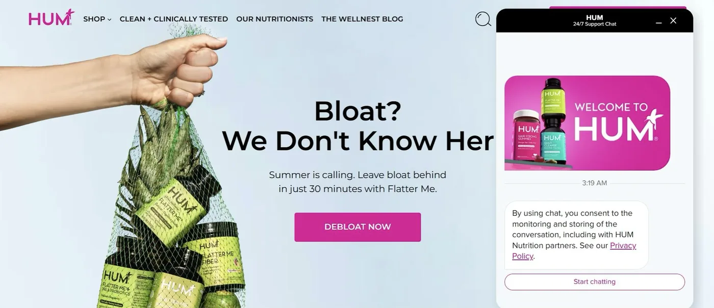
Source: Humnutrition
The results speak for themselves. HUM has seen increased subscription rates and reduced churn by providing instant support exactly when customers need reassurance.
This strategy demonstrates how strategic support placement can transform potential abandonment points into conversion opportunities.
Boosting Decision Confidence by Removing Visual Clutter
When visitors face cluttered pages with competing elements, they experience decision paralysis. Smart ecommerce design strips away unnecessary distractions and creates focused pathways to purchase.
This minimalist approach is both visually appealing and drives measurable business results. Studies show that removing just one form field can increase conversions by up to 50%. Reducing choices can actually increase purchases rather than limit them.
The answer lies in determining what’s truly essential versus what’s merely nice to have.
Here’s how to implement this approach:
- Audit every element on high-traffic pages and justify its presence.
- Limit primary navigation options to 5-7 main categories.
- Create visual hierarchies that guide attention to key actions.
- Use progressive disclosure to reveal details only when needed.
- Increase white space around CTA buttons.
- Remove redundant information and consolidate similar functions.
- Test simplified designs against current versions to measure impact.
Remember that simplicity doesn’t mean eliminating important information but organizing it thoughtfully.
A great example is Medical Alert Buyer’s Guide, which reviews and compares medical alert systems for seniors. Recognizing their primary audience of older adults, they’ve created an exceptionally clean interface with generous white space and limited sections on their homepage.
Their navigation presents only essential categories, with large, clearly labeled buttons that accommodate vision limitations. Product showcases clearly highlight important details without overwhelming visitors with excessive technical specifications.
By removing common ecommerce distractions like animated banners and pop-up promotions, they’ve created a focused environment where visitors can confidently evaluate options.

Source: Medicalalertbuyersguide
This type of streamlined interface can lead to longer session times, lower bounce rates, and higher conversion rates compared to industry averages.
So, prioritize clarity over complexity, and you can create an experience that builds trust with your audience. Sometimes, what you remove from your design matters more than what you add.
Capture Mobile Sales with Purpose-Built Design
Mobile shopping has shifted from a convenient alternative to the primary purchase channel. Despite this reality, many ecommerce sites still treat mobile as an afterthought, designing for desktop first and then scaling down.
This approach leaves money on the table. Ignoring mobile responsiveness could mean losing a quarter of your sales as frustrated mobile shoppers abandon difficult-to-navigate sites.
The most successful ecommerce businesses now design with mobile as the primary experience.
Here’s how to implement this approach:
- Implement thumb-friendly navigation with tap targets of at least 44×44 pixels.
- Place key actions in the “thumb zone” where users can easily reach while holding their device.
- Minimize form fields and implement autofill wherever possible.
- Use collapsible sections to manage content without overwhelming small screens.
- Ensure product images can be easily zoomed and swiped on touchscreens.
- Test actual loading speeds on mobile networks, not just desktop connections.
- Replace hover effects with tap interactions that work on touchscreens.
- Optimize checkout specifically for mobile with digital wallet options.
The goal here is to create an experience specifically designed for on-the-go shopping.
WholeWoodPlayhouses, which sells DIY outdoor playhouse kits for children, is a solid example. Rather than simply shrinking their desktop site, they’ve built a dedicated mobile experience from the ground up.
Their mobile interface features large, easily tappable category buttons and a persistent search bar that remains accessible while scrolling. Product pages intelligently prioritize information, showing vital details first while keeping secondary information in expandable sections to maintain a clean interface.
Their mobile checkout is particularly impressive. Streamlined to fewer steps with smart defaults and prominent digital payment options that eliminate the need for typing credit card details on small screens.
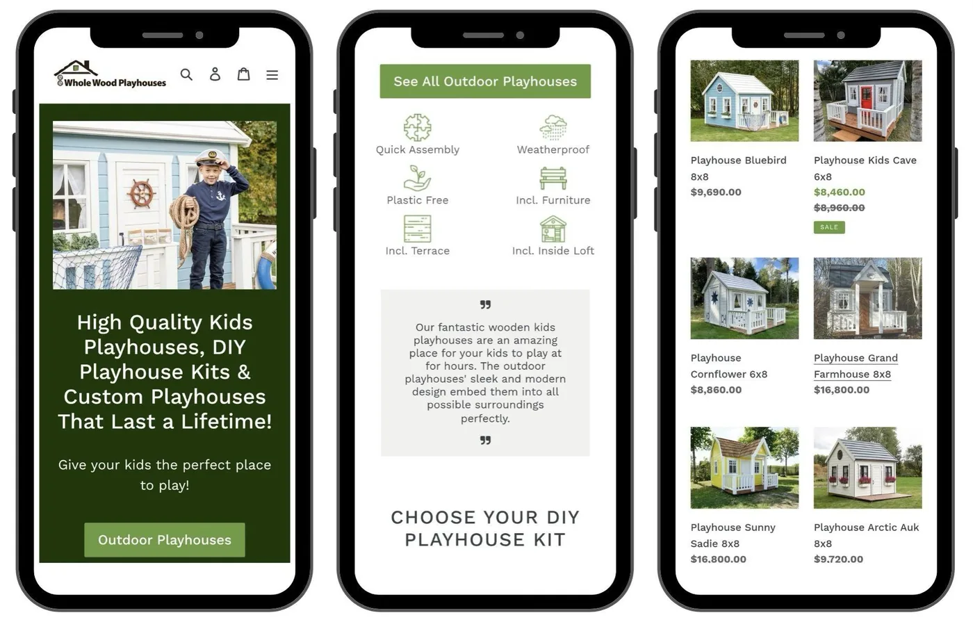
Source: Wholewoodplayhouses
Treat mobile as your primary channel rather than an alternative, and you’ll get a solid chance at capturing revenue that your competitors miss.
Final Thoughts
Smart design can help you make things easier, faster, and more useful for the people who visit your store. And the payoff is real. Ecommerce businesses that invest in better UX often see nearly twice the revenue growth of those that don’t.
If your site isn’t working for your customers, it’s working against your goals. The next step isn’t always a full redesign – it might just be fixing the friction. Start there.
Frequently Asked Questions
Why does good UX pay off for an ecommerce store?
Good UX pays off because a clean, easy-to-use store helps people find products faster and reach checkout with less friction, which turns more visitors into buyers. Many businesses lift conversion rates significantly just by improving the user experience, without a large redesign budget. Often the next step is fixing the friction, not rebuilding the whole site.
How can I reduce friction in my online store?
Reduce friction by giving visitors what they want quickly: clear and simple navigation, popular products surfaced on the homepage, smart predictive search, and short, direct paths to checkout. Use your analytics to see what people visit and search for most, then shape your homepage and key landing pages around that. Every extra click or confusing choice drives potential customers away.
Does mobile design really affect ecommerce sales?
Yes, mobile design has a direct effect on sales because mobile shopping is now a primary purchase channel, not an afterthought. Treating mobile as your main experience means thumb-friendly tap targets, fewer form fields, easy image zoom, and a streamlined checkout with digital wallet options. Designing for desktop first and scaling down leaves money on the table.
What simple UX changes can boost conversions?
Small, focused changes often boost conversions the most: speed up page loads, remove unnecessary steps and form fields, increase white space around call-to-action buttons, and add instant support like a chat widget at decision points. Reducing visual clutter helps shoppers decide with confidence instead of facing decision paralysis. Test simplified versions against your current design to measure the impact.
How does customer support improve the shopping experience?
Instant support turns potential abandonment points into conversion opportunities by answering questions exactly when shoppers hesitate. Position chat widgets where they are accessible but not disruptive, let a chatbot handle routine questions about shipping and returns, and provide clear escalation to a human for complex issues. Support should feel available without feeling intrusive.